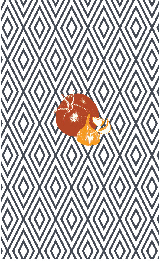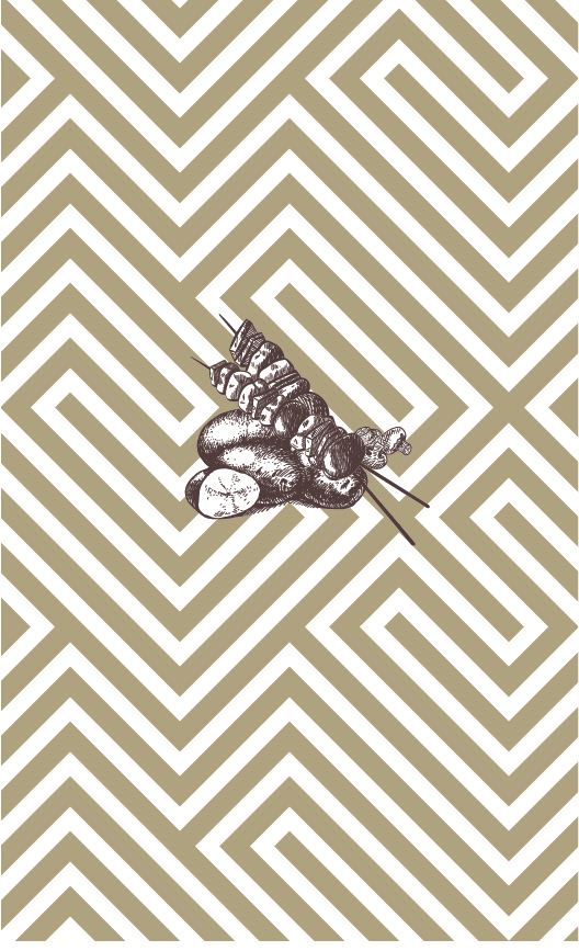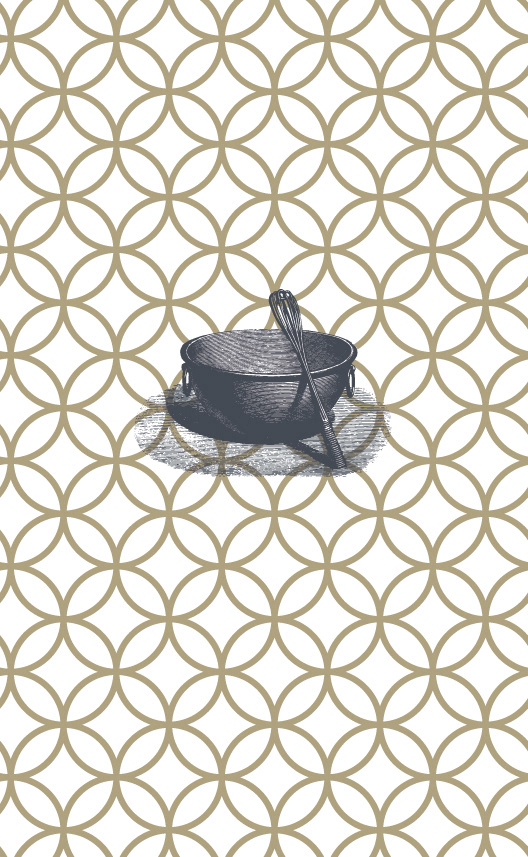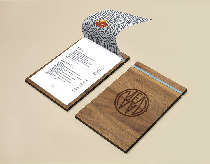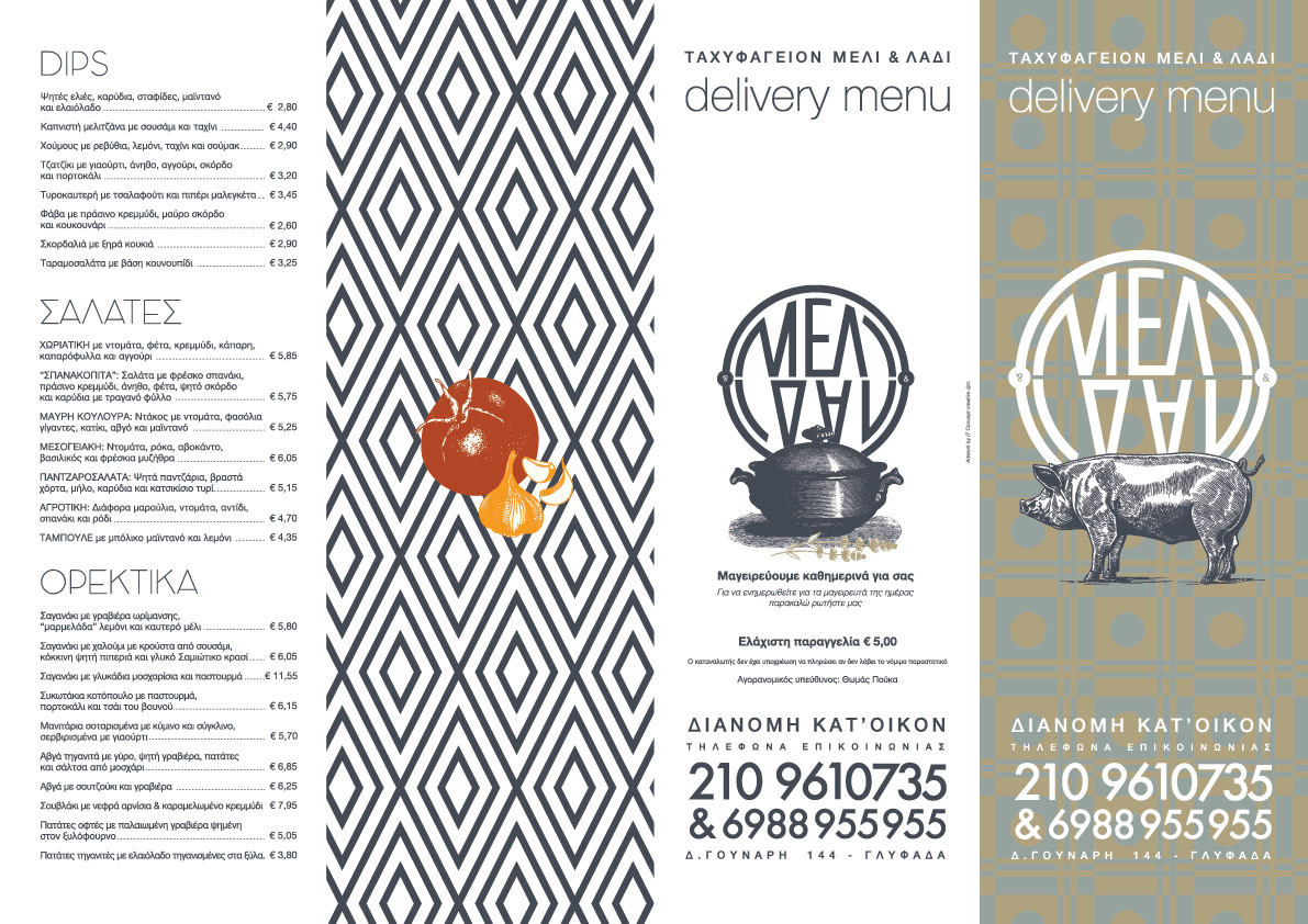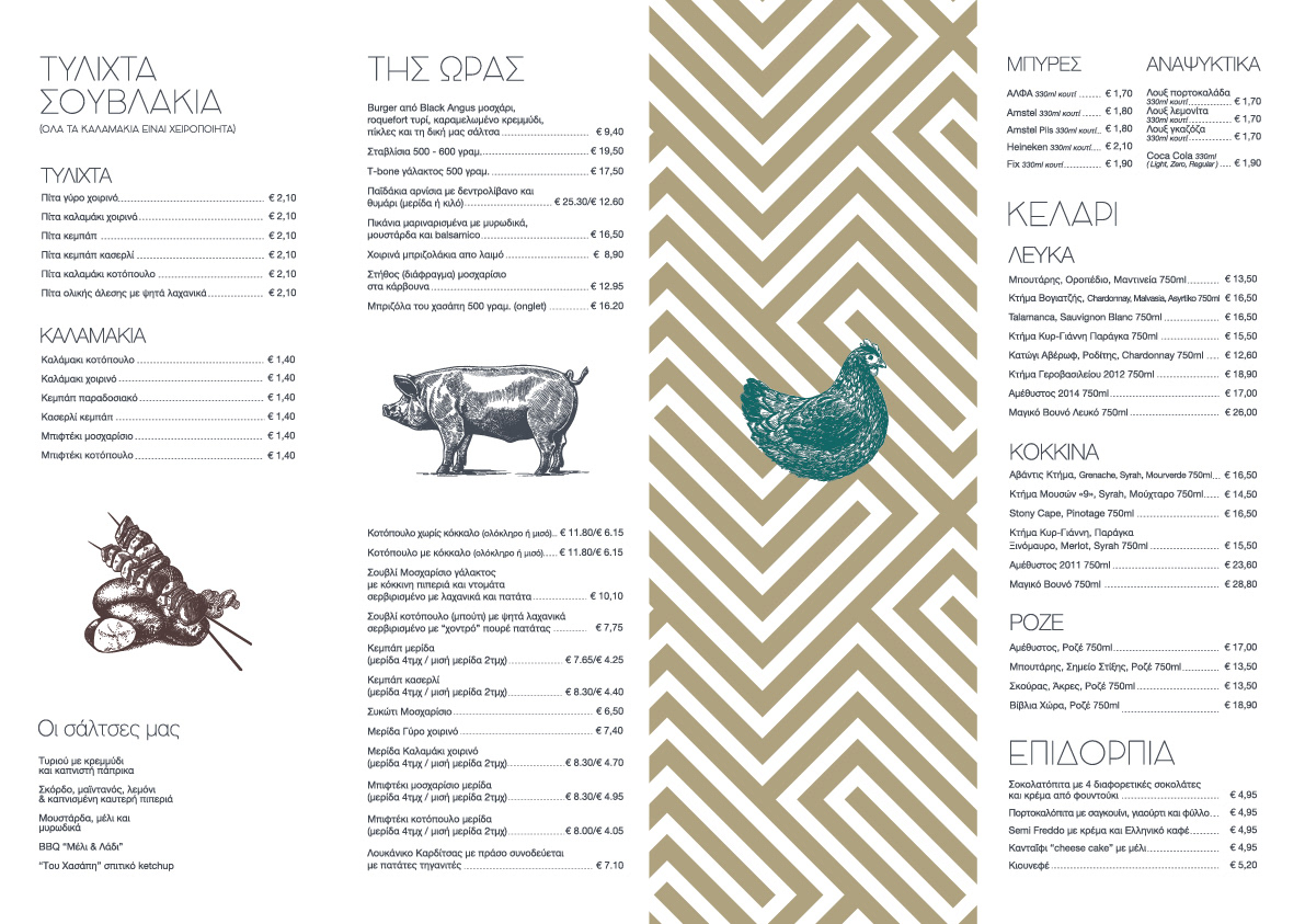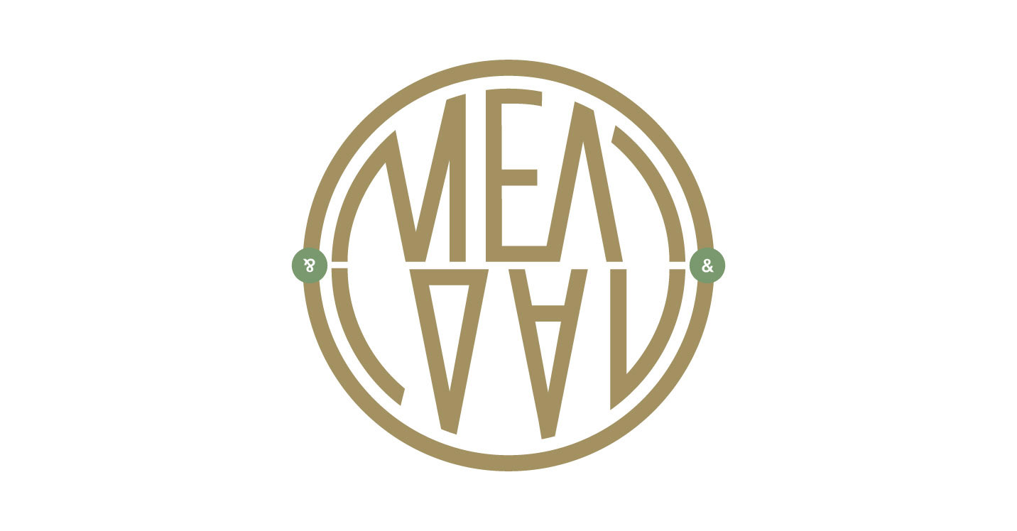
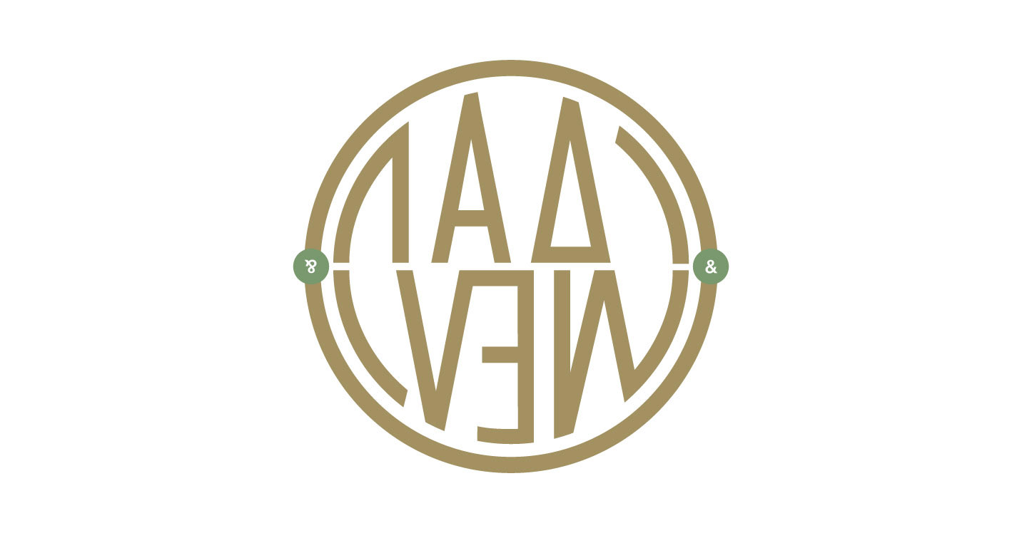
The project was based and primarily focused on Greek old typography, and giving a modern dynamic sa well. Geometric forms relied on patterns used in the 60s. Logo presents the particularity to be read by being rotated 180 degrees, since there was the business orientation to marketing both elite species, from small Greek producers.
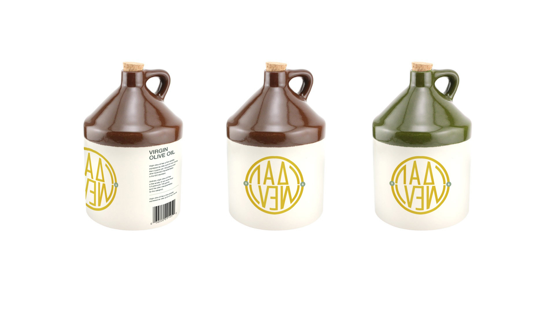
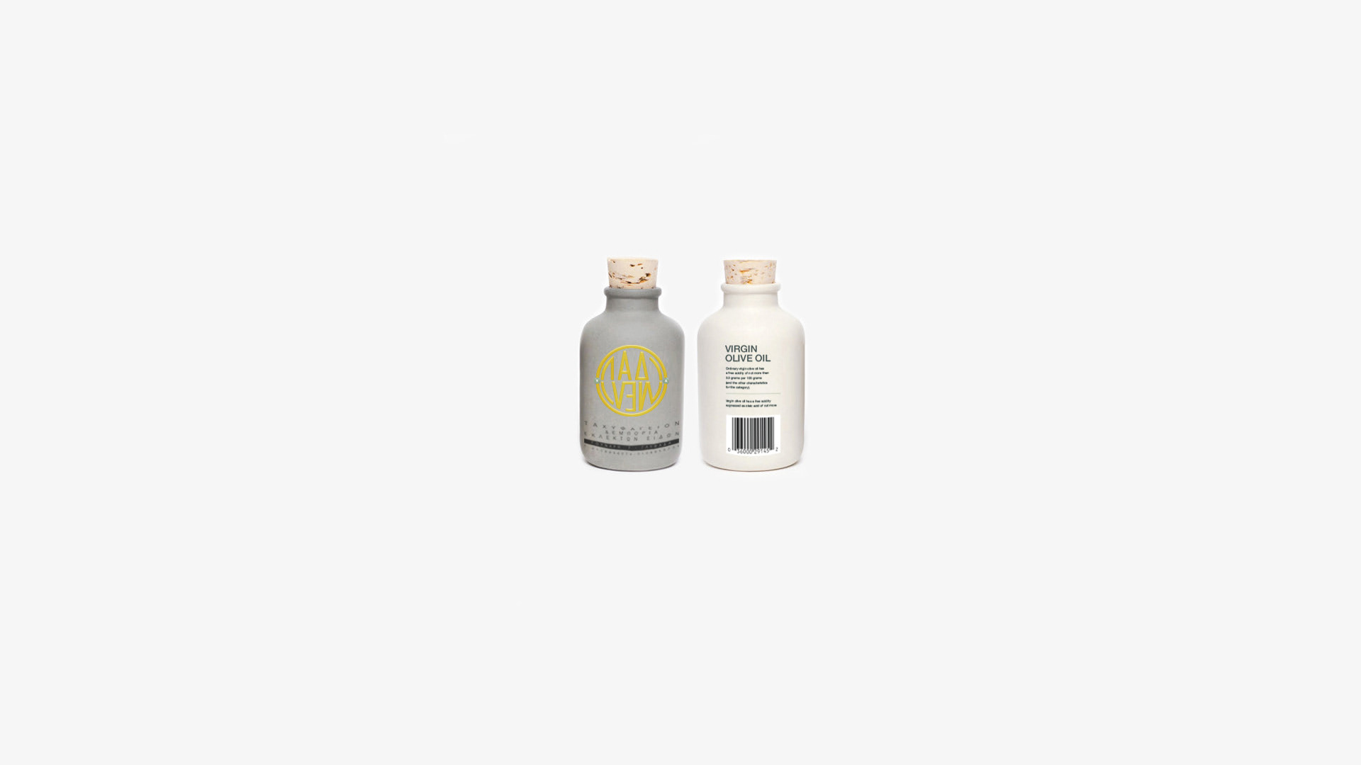
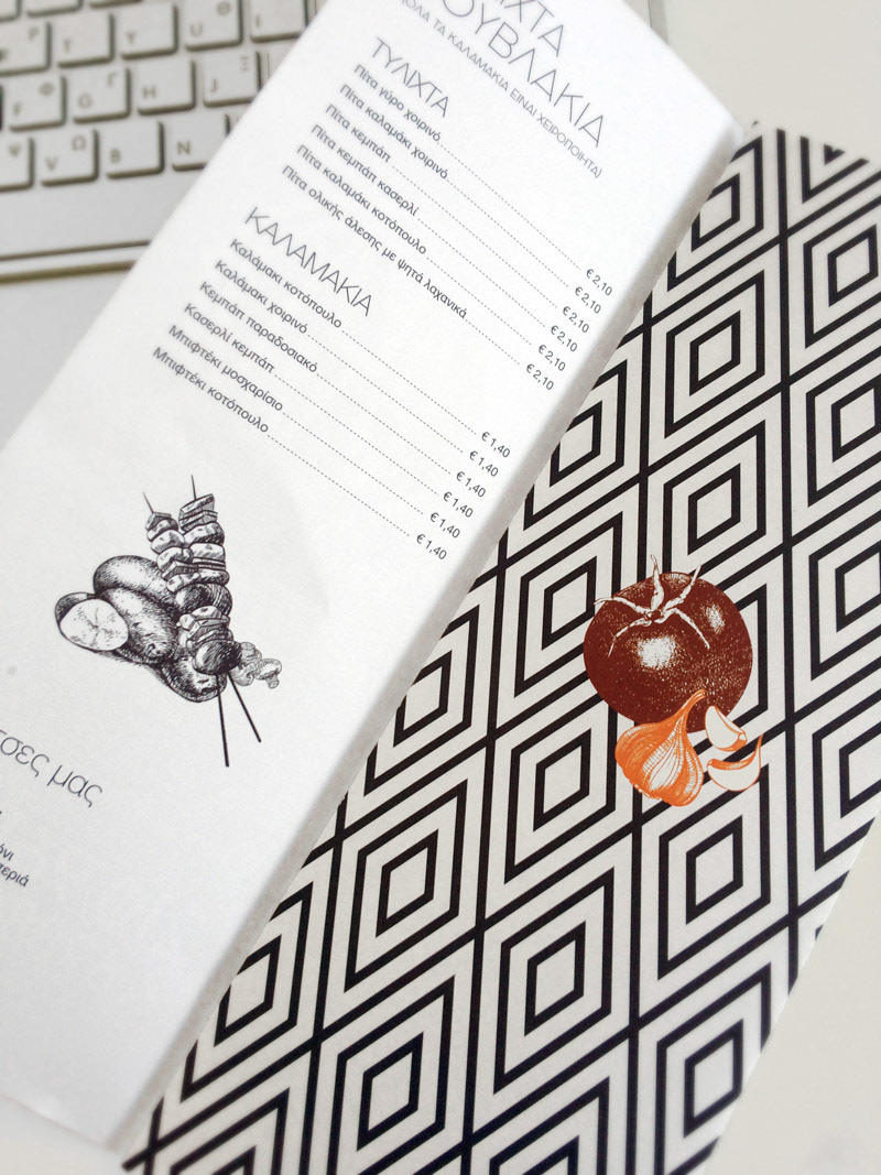
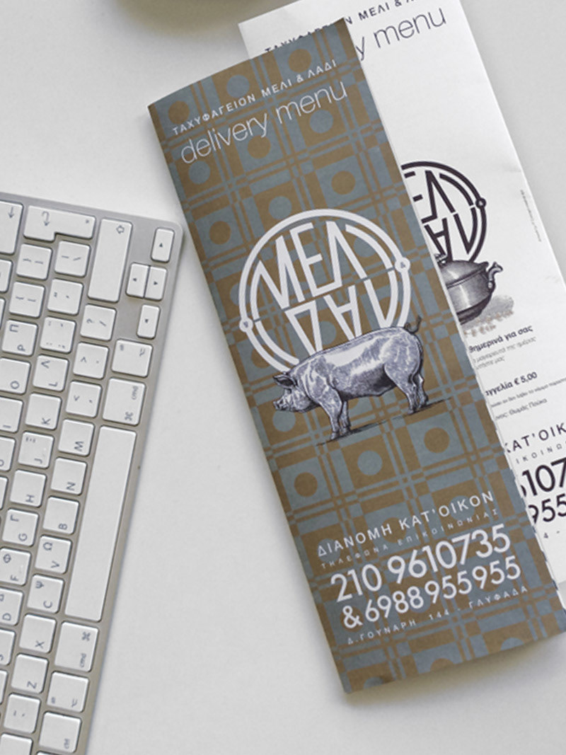
Applications menu and packaging are made with the same principles. Simple forms supported by geometric patterns and graphic depictions of themes .